30 August 2010

Tips n Tricks #7: Granular Sweeps


Its post number 200 and what better way to celebrate by sharing more tips and tricks with you! This chapter is about the 'Granular Sweeps!!!!' which is a technique that is passed onto me by Martin Johnson. Its a way to get textures to indicate dirt or wear into a character with a few simple sweeps which is the reason I assume Martin calls it this. Its an easy technique...
Lock the character's silhouette (as shown in previous chapters about alt linking and having the character on a separate layer) and use the brush provided in the image above to gently brush in the worn details. Thats pretty much it! You can always go over what you've done with a standard round brush to clean things up.
Nice easy one for ya :) Happy painting!

29 August 2010

High Ground


So often when you keep going through doubt and struggle that you will eventually find the breakthrough. Lately Ive been trying to push myself more to get better and I collected a load of fantastic artwork to surround myself with so I can keep checking what my goal is by just glancing over these artwork. As expected it was pretty overwhelming to see how much I needed to learn but I feel like something is clicking in a bit now. Its one more step to being the best artist you can be!
Self Crit: Can tighten up some edges (some blurred areas). Haze can be generated with more thought rather than just use a soft brush across the place.
Some inspirations for the day: Darren Yeow is a talented artist and he shares the story of his journey in the link provided. A very inspiring story I thought!
A colleague kept spamming artist sites at me and they have been leaving me absolutely floored:
Paul Lasaine, Paul Felix, and Robh Ruppel

Photo Ref Study 03

28 August 2010

Speedpaint Gone Wrong :P


Heres another speedpaint that turned out like crap! It was better a few steps before the end but I messed it up hahahahahahahahaha!

Sayonara - Satoshi Kon Tribute


A tribute to animation director Satoshi Kon who recently died of pancreatic cancer. I was a fan of his films Paprika, Toyko Godfathers and the film Perfect Blue is considered to be among the greatest of feature anime. However I has most moved by his final statement that he left behind and was published posthumously by his family on his blog. The English translated text can be found here. It is a overwhelming read knowing that these are the final words someone is leaving behind and its very admirable that even when close to his death he could be positive and sometimes humorous whilst reflecting on his life and was grateful for living in the world that he had come to love. Stories like these remind me to be grateful of everything around me that we take for granted. Its easy to forget about the little things that makes life wonderful. So this post is about being grateful :)

27 August 2010

Tips n Tricks #6: Tonal Striping


Another quick tip I learnt from observing and watched it discussed in a tutorial. This is a theory more than a technique on how to attain an illusion of depth. You can achieve this through atmospheric perspective but I wont discuss that (as it involves light behavior that I am not completely knowledgeable on). So tonal striping is a trick you can add to your environments to add depth and I try to do this where I can (unless I forget :P). Basically, you have to vary the tones in the environment as you venture towards the distance. This avoids things appearing flat as you are literally adding depth through a variety of values that helps pull your eyes about. The image above is pretty self-explanatory of this. So where you can, add some variety into your values!

26 August 2010

Big Rock


Speedpaint from the last two lunch breaks

Music of the Night


More photo study

25 August 2010

Cute But Evil


Another sketch for the Chiustream. My actual entry was pretty crud and I wasnt happy about it so I tidied it up somewhat.

Enviro Study


Heres a study off photo ref... this is the 100% view... not a big document so I can keep out of the details... more to come... gotta jump on the Chiustream now bye!

Tips n Tricks #5: Finishing


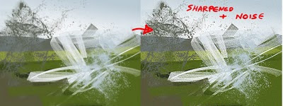
Haven't written one of these in a while so lets post a quick tip. This is something I do a lot near the end of a painting or maybe I will use it on isolated layers for random speedpaint-esque work. This just sharpens up the image and makes things a little crisper but can go a long way (careful not to go too crazy and have things super sharpened or noised up). It will alsodepend on the type of painting too as some of the softer painted characters Ive done didnt seem to work well with this technique as I usually try to punch out the edges manually but I find it useful for environments where there are loose strokes akin to speedpaints.
This is simple, I throw on a Smart Sharpen filter over the image by clicking on the top-bar Filter>Sharpen>Smart Sharpen. There I fiddle with the 'amount' slider. The amount I add depends on how big I am working (and therefore how visible the effect will be is something I consider). For the image above I put the amount close to maximum and added it on again with a smaller amount. The second thing I normally do is add a noise filter. Go to Filter>Noise>Add Noise. I usually put in something between 0.7-3% on this filter but that is just my preference and you should experiment how you please. So that is how I tighten things up automatically. And with a bit of noise, you can get some random colours in there which might be an idea to use as a base to colour pick in a speedpaint?
Some people like to alter the levels (ctrl+l) at the end too and bring the left and right triangles inwards a bit to raise the contrast, or use colour balance (ctrl+b) to unify everything by adding a shade to everything. I kind of do this throughout the painting process but try it out however it suits you.
More to come! And whilst Im here I'll drop a link to Sketchoholics which is an art community site set up by one of my art heroes Bobby Chiu to encourage people to practice their art. As always, hes motivating and inspiring to me :D

24 August 2010

Scraps


Been trying some different approaches and get the hang of it. As usual in the beginning stages there will be lots of crap but I thought Id show a few of them otherwise I wont have much anything to update with if I keep throwing these away. I have more anatomy studies to do too so there might not be much flashy posts in a while.

23 August 2010

Ganondorf


Ive been feeling like playing a Zelda game lately but since I dont have my old games with me and the new one isnt out for a while I thought instead I'd try redesigning some of the characters from the series. I havent quite done a decent fan art of my favorite games franchise in a while and it is the series that got me most enthusiastic about games and subsequently got me drawing the characters. In my research diggings I found some non-canon mangas that Ive been reading. Check them out here.
Ganondorf is the main antagonist to Link and Zelda. He is the leader of the Gerudo people, a tribe of thieves that dwells in the desert west of Hyrule. Every hundred years a single male is born into the clan that consists entirely of women which by Gerudo law makes this male the king of the Gerudos. Ganondorf's desire is to possess the Triforce, the ruling power of the lands giving by the three goddesses which will change the world to match the heart of those who touch it. Upon touching the Triforce, it shattered into three segments and found its host in the individuals most suitable for their attributes: power, wisdom and courage. Ganondorf managed to retain the Triforce of Power and seeks the remaining shards to realize his ambitions in ruling the world.

21 August 2010

Wind


For the AIB art blog. The symbol on the character's back means 'wind' and is one of the four elements from the I-Ching. The idea I had for this is that each member of the martial arts school is assigned one of the element classes dependent of what their characteristics are. Sing is labeled with the wind element for his playful and carefree nature.

19 August 2010

Magic Hat


A 40min painting done for the Sketchoholic Marathon. Really enjoyed these quick ones, I still labour too much with some of my paintings and sometimes overwork it and hate it :P Got to keep painting with big broad strokes!

15 August 2010

Behind You!


Another watercolour :)

All In You Head


Another piece for the Chris Sanders competition. Hmmm... may may MAY try doing another one. I wasnt happy with the previous watercolour so I might try redeeming myself in that medium.
I feel Ive regained my working pattern. A while ago I felt pretty productive but then I went away on a few holidays and when I got back I found it was a bit trickier to get in the mood to do my own artwork. But slowly trying to do something each day no matter how small helped me to regain fitness! Once you get into the habit of it its not so daunting to pick up that pencil and draw anymore, it becomes instinctive and second nature :D
On another note, my colleague Bryn Williams has set up a blog to put his concept art in. Take a lookie!
Inspiration for the day: Ben Lo - Hey! Found a concept artist with a similar name to me! Had to take a look at his work! Now I feel humbled lol!

14 August 2010

Tips n Tricks #4: Alt-Linking


Righteo. Thought I might as well post this one up too since it ties into the previous tip. It might be better to read tutorial #3 before this one. Alt-linking comes after you have a layer with an opaque silhouette with the rest of that layer transparent. This trick allows you to create a new layer and link it to another layer, so that whatever you paint onto this new layer it will retain the silhouette of the layer that it is linked to. This opens up a lot of useful tricks for you to pull off.
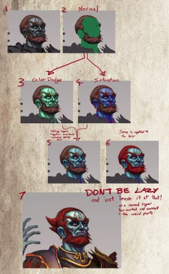
But first... how to make an alt-linked layer. Say 'Layer A' has the silhouette you want to retain, make a new layer above it (lets call it 'Layer B'). Hold down the 'alt' key and place your cursor between the two layers, the arrow of your mouse should change into two linked circles. Click between the layers whilst the arrow of the mouse is in this linked circle form and VOILA! You have a linked layer! Now the best way I can describe how this is useful is to use an example (the above image).
At Stage 1 I have manually painted the face but realized the colour is very dull and boring. The solution I thought was to introduce some colour to it. At Stage 2 I blocked in some green over his face (this is done on an alt-linked layer). Stage 3 and 4 shows some of the results that interested me when I toggled the layer blending options around. Just experiment! In Stage 5 I duplicated the green layer and them set to the two blending modes I liked. So now there are two layers altering the colours. The result is quite saturated so I fiddled with their layer opacity before merging the layers together. In Stage 6 I used the same technique to change the hair colour. And then my final point shown in Stage 7, DONT BE LAZY!!!! Do not just accept the results from these adjustment layers. Most of the time they can look too digital and so you should try painting over the results to correct the areas where the colours seem unnatural etc.

BONUS: Lets throw in another small trick I use in conjunction with the alt-links. When Im painting something that is looking flat in its form I sometimes create an alt-link layer and set it to overlay. Then using the radial gradient tool with a light colour (often a desaturated one) I add pockets of light values. The radial gradient's fade off reminds me of a lit sphere and gives an impression of form. Dont leave it at that though! Use it as a basis and paint over it!

Tips n Tricks #3: Silhouette Control Using Lock Transparency


Here is a technique Ive started using more and more recently. Its focused around building the silhouette of the character (or what ever your subject is) and locking that so it becomes a mask that you can paint within. I found this liberating for my brushstrokes as I can paint loosely within the mask and keep control still as the silhouette is fixed and can not be altered unless I deliberately want to (so painting outside the shape does not show up). This is important for me because I use to paint tightly with a small brush into the details too early but with this I can be more broad and the shape will retain itself. Its always been told that painting broad first is the best approach and that getting into tiny details comes last. Now I think I found a way that helps me to do this.
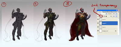
First off I drew the line drawing and after that I paint on a layer beneath that with a 100% opaque brush and just fill in the lines and silhouette. Once the silhouette is as you want it you will need to lock the layer by clicking the 'Lock Transparency' icon on the layers tab. Unclicking this icon will unlock the transparency (oh yeah... make sure its a new and transparent layer before you paint otherwise the 'lock transparency' wont work). Alternatively you can paint on a flat opaque layer (with no transparency) and you use the magic wand tool to select shapes and paint onto a different layer with the selection making a stencil. Oooorrr you could use the 'alt-linking' method which I will cover in its own chapter.
So that covers the steps it took me from stage 1 and 2 on the image posted. I will cover how I got to stage 3 when I talk about alt-linking.

13 August 2010

Sculptris Addiction and Some Al.Chemy Magic


Sculptris modelling born from a ball.


A quick demo on what you can use Al.Chemy for. It is more of a sketching/ thumbnailing program used to generate shapes. Its another way of brainstorming and designing that lends itself well for mechanical things. Usually I will try to generate a number of interesting looking elements and then take them to photoshop where I rearrange them and piece them like a jigsaw and cut out parts I dont like. Then you can use the shape as a mask and paint into it!

12 August 2010

Bendragon now in 3D!


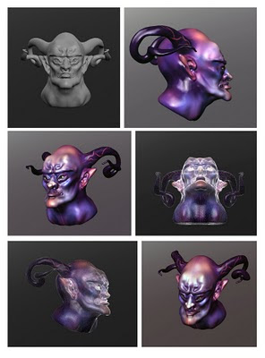
Had some free time at work today and spent a while experimenting with the free 3d sculpting package, Sculptris (similar to Z-Brush but made very simple). I started this with the basic head template that comes with the program and then just pushed and pulled the virtual clay around for quite a while. It is very intuitive and also you can also paint on the 3d models in the program! I left the wireframe on some of the shots cause I kinda like the rimlight look it gets from it. Maybe more Sculptris work to come! Its a neat package that is great for people like me who are frightened off by the complexity of Maya but would like to be able model things. Checkout SketchUp for another easy to use 3d package. I also want to show you a program called Al.Chemy too. We've been using it in the studio a fair bit in our work and I thought Id do something with it and talk about how I use it in concept art so thats something to expect in the future.
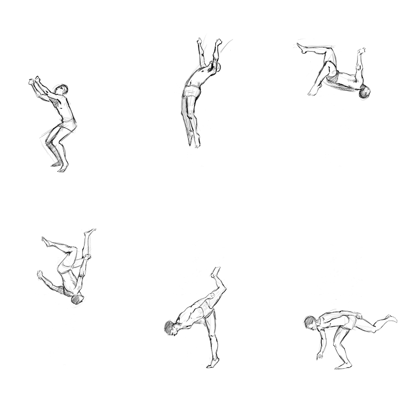
Lastly, something pretty old. I did a few anatomy studies off photos and referenced off a sequential album and put the drawings together in an animated gif (you need to click the image for it to work).

Invoked Evil


A watercolour painting for a competition hosted by Bobby Chiu and Chris Sanders. This began life as a watercolour painting but underwent quite a lot of photoshopping. There were a few blunders involved with the traditional paints and I tried to salvage it by altering the colours and values digitally. The scans didn't turn out well either since the painting couldn't fit through my scanner which also added to the list of things to sort out digitally but I think in the end it turned out fairly well(ish). Let me know what you think, I dunno if I should touch this up some more (turn up the contrast or even turn it down to help it retain a bit of a traditional look).
Also planning to do another painting to accompany this. Maybe a digital version is in order.

Some inspirations: Chris Sanders himself - Nice stylized and cute characters and also director of some awe inspiring films such as 'How To Train Your Dragon' and 'Lilo and Stitch.'

10 August 2010

Tips n Tricks #2: Value Checker


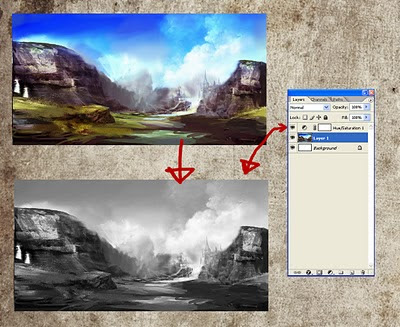
Another trick I want to quickly share. Ever since someone over on conceptart.org gave me this tip I have been using it for almost every painting Ive done. What this does is create a physical layer that desaturates everything underneath that layer so you can toggle it on/off to switch the painting from its current state to a grayscale one. The reason you want to use it is to keep a constant check on your values. The theory being that if it reads and works in simple black and white values then really any colour on top of that works. This is a layer I frequently turn on and off to make sure Im keeping things readable. So here is how you create it...
On the bar at the top of photoshop click Layer>New Adjustment Layer>Hue/Saturation. A new dialog box opens up asking you to name the new layer (just click OK) and then another box will open with all the goods inside. You have a few sliders and the middle one should control saturation, drag it all the way down (to the far left) and click OK. And voila! Your very own value checker :P

9 August 2010

Tips n Tricks #1: Channel Nudging


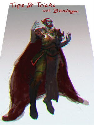
Hey all! I learned a new trick today from my friend Sukh and thought Id share it here. Then, thinking about it I thought I might make occasional posts about little tricks I find out or talk a bit about other useful things about art. So today's big idea is channel nudging!
Dunno if that is the official name for it but I'll run with that for now. Well the effect it creates is something that looks like an old 3d glasses filter. The process is simple... just go to the channels tab and select the colour rages (ctl+a) and use the arrow keys to offset (nudge) them a bit. Alternatively you could use a filter by going to the tool bar at the top and clicking Filter>Distort>LensCorrection and then play around with the Chromatic Aberration sliders. You can also use this filter to distort the image like I have done above by fiddling with the Transform sliders at the bottom of the pop-up screen. This might be helpful to get a slight feel for a low camera or a high one but push it too far and you can break the perspective altogether so its might be a bit limited. However it can act as a basis for you to paint over no?
Happy experimenting! ^_^

Future episodes: Alt linking tricks, sharpening and finishing, textures, stamp brush, granular sweeps, locking silhouettes, value checking, tonal stippling and other things I discover (if you have any requests or questions let me know and I'll try tackle them).

8 August 2010

WIP: The Great King of Evil


Work in progress. Can anyone guess who this is a redesign of?
Ive been meaning to do some fan art/ redesigns of my favorite game franchise for a while. So why not start now? Ive use a few new techniques for this one. Sometimes I think I labor too much into a painting and so have been meaning to try a different approach. So Ive been trying to adapt a bit of a colleague's technique and mask off the silhouette so that I can paint freely and quickly whilst still keeping control of the shapes. I ditched the opacity round brush for most of this (cause it forces me to get into details and I get carried away) and taken up a solid opacity round brush with size pressure (with opacity constantly on 60%). Also used layer blending options to alter colour and add lighter values (coupled with radial gradient to get that spherical fade off). Stay tuned for more.

7 August 2010

Princess Mononoke


Done for a competition hosted by Bobby Chiu and Pixar's Dice Tsutsumi! Had fun with this one, some of the challenges was in getting the poses down and render the lighting. Ive still got some way to go with both these aspects but every painting is another step in the right direction! So onwards to more painting!
Lately I have been really enjoying my work a lot more. I think it finally sunk in that Im in a games studio doing what I love as a profession. I really enjoy working with other artists here and have our discussions on arty topics. Collaborating within a team is also great fun when we bounce ideas about and be involved in other areas other than concept art too. I am delighted that we are sharing ideas and encouraging one another and everyone getting excited together. I actually cant wait to go back to work on Monday :P
In other news... My friend and colleague Martin Johnson has released his new website here. Check it out. He is a great artist to have in our team. He has been feeding me anatomy knowledge for some time which is why you saw my recent updates with anatomy studies. I probably wont upload much more of them since they are kinda boring to look at. I dont want to fill the place with the same stuff :P So there should be some more interesting things to look at in the coming updates!

2 August 2010

Lets draw baby!

More studies mixed in with some drawings from my head. Wow anatomy can get a bit addictive when you get into it :P Still not quite there yet but that is why I do these studies :D Putting time and effort into bettering yourself is well worth it and the results can be you landing that dream job and lifestyle you wanted so isn't that reason enough to go mental and study your craft like a nutter?