Some colours applied. Should have kept working on the grayscale but I got a lil bored so I jumped a step forward. Im most likely going to work up the values more.


I wanted to show how I draw on Photoshop for a while and since the Shiek drawing got some good feedback I decided to use this one as an example. Here we goooo....
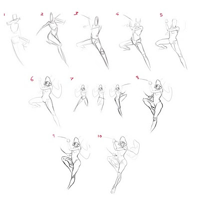
1,2,3) I often start out with some gestural thumbnails. Forget about anatomy for a slight moment and just concentrate on the pose, the energy and the action. This stage is all about getting an interesting feeling and direction to build on top of so it is quite an important stage as it dictates your whole drawing. It is the quickest phase but one of the most important in the planning. I opted for thumbnail #3 at the end. I think the raised arm across the body had a lot of authority to it especially with the head tilted down but with eyes looking up. The legs I wanted to be posed in a dynamic way as if the character is hanging in mid air which helps to show her attitude as an agile ninja. 4) As I said before, drawing alternates between gesture to structure to gesture to structure etc. With the foundation set I try to add some structure back into the gestural movement. In other words I start to build the anatomy into the gesture. 5) With the structure down I add the gesture back into it. It is easy to make something look stiff when you put anatomy into something so this part is about editing what part of the anatomy to show and what not to and also to add some movement into the forms (get some curves and striaghts in where the form turns etc). 6) Now I start the drawing that will appear on the surface. The construction is all but done. I start to think about the costume sitting on the character. 7) The legs was bugging me for a long time and I decided to explore alternatives to it so I turned to the quick way of solving a problem.... thumbnails! I felt the upper and lower body didnt look like the same pose as if they were both cropped together from two separate ones. 8) With the legs decided I draw back in the anatomy and the gesture. I also tilted her shoulders the other way to balance the pose. Generally the shoulders and pelvis tilt the opposite directions to counterbalance each other, however the character is hanging in the air so that law doesnt necessarily apply. 9) Some slight tinkering with the legs. It had too many straight edges and needed simplifying more. Also I toned down the exaggerated obliques that dangles off the illiac crest (pelvis) 10) Back to drawing the surface again. This isnt quite finished yet but the process from here on is a repeat of the ones I already listed so you should get an idea of how I draw now.
NOTE: Ah almost forgot to mention. Whilst I was drawing this I had an anatomy book by my side if I needed to check up on how muscles are bundled together in the legs and arms. I also had an anatomy manikin by my desk to reference so dont feel like you should do this without reference. It can be easily ignored but it is one of my secrets to improving. You constantly have to call upon what you know already (your visual library) but if you havent observed enough then your visual library will be thin and you will have little knowledge of shapes to call upon. Using reference helps me to observe and so I will always be discovering some new shapes rather than guessing.
Oh and one final thing.... I found this on the internet and thought it was spot on and wanted to share it here. Another thing I wanted to post about is why I draw. I have a job already but I still draw in my own time. I want to try explain it one day... Have fun doing what you love, friends!


A few of my colleagues are entering a cg competition on Polycount to redesign a character from a fighting game. The community is primarily a 3d one but I felt too excited by all the talks of what each of us were going to do that I had to go do my own version and not feel so left out :P I picked Yoshimitsu from the Tekken series to redesign. I have also shortlisted Hsien-Ko from Darkstalkers and V-13 from Blazblue to do but I might also work on those when this one is finished.
My direction with this version of Yoshimitsu is to reinvent him as an oni but suited up in samurai gear. So the human proportion was ditched for more of an ogre build, looking back at this now I think a part of that is lost under the armor so I will have to tinker with this some more. I elongated the torso and arms to try give it a bulky upper body though it might need to be pushed some more and I think adding more hair/ mane will help and perhaps a little tail too. Also I did plan to add a flaming circle emblem behind his head quite like ones you would find from an oriental statue of a deity.

Its been a while since Ive done some tutorials and shared some information. Lets take a look at the Legend of Zelda painting. I saved a few steps so that i could go back to them but towards the end I worked on the same file so there is a sudden jump in the rendering. I usually save new files for big changes and usually these happen near the start, the reason the last parts jump in rendering is because a lot of the problems are already solved in the beginning so that I feel confident enough to just work in one file. Here we go...
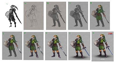
1) Started off with some thumbnails, focusing on silhouette with some slight suggestion of what the details could be. 2) With the thumbnail chosen I began drawing the proper piece. But I am not liking it very much, the face is bad and the chest is flat. 3) So I lowered the opacity of the drawing and began to draw over it on a new layer. I threw on some hints of value help me keep an eye on the silhouette. 4) Drawing done! Now I have a stronger direction of what to do. With the anatomy put down that is one less to think about. The design is mostly solved in the drawing which is yet another thing I can worry less about. The lighting is suggested here with some basic values. when I colour a grayscale I dont bother to get tight with the black and white values as they will eventually be changed by the colouring layers anyway. From experience I tend to find it best to keep the value drawing low in contrast and leave yourself room to change the contrast later. Layers like overlay and multiply can push your contrast way over the top if you go too far. 5) My prime colouring layer is the 'hard light' layer. I just find it works for me when I have a low contrast grayscale drawing. The colour added in this step is all done on the 'hard light' layer. 6) Now I am pushing the contrast some more. I use multiply layers for shadows and overlays for highlights. The overlay layer also lets me add in some colour variety and noises to make things a little more interesting to look at. Since I worked on a low contrast grayscale, I now have the room to control my values. I have lost control of values in my early works and its a lesson Ive learned so now I am always aware and trying to be deliberate with how strong my darks and lights are. Leave nothing to chance or coincidence! Be deliberate! 7) Just continuing the previous steps into the areas I didnt colour yet. Now I flatten the layers down and work on the image on normal layers. Be aware that using overlays and all the other layers to colour an image doesnt give you a realistic light and colour look. I use this colouring grayscale method as a starting point rather than an end. So once your foundations are set, flatten it and paint on it like its a normal canvas. 8) Most of the problems are solved, the blue print is layed out. Now comes the some what tedious and long rendering process. Just paint out the forms, paint the forms of spheres, cylinders and cubes where the forms resemble those shapes. I add a strong rim light to pop the character some more. And went into the levels tab to up the contrast. 9) Again with the same old rendering. No fancy tricks. Just a round brush. A few texture overlays for the shield metal finish and colour dodge layers to the jewels glow. I used the lasso a few times to paint freely whilst keeping a solid silhouette (example in the sword). Since the layer is all flat I cut the character out of the background with the eraser to keep the edges sharp and clean. Shadow done with a single soft brush stamp mark that I skew and transform into place. But dont just leave it like that! Work into it somewhat to knit it into the character. There are darker regions where the light can not reach under his boots etc. 10) Finishing up the last few unrendered parts. Added some text and logo to accompany the piece. Finishing touches often involve applying a smart sharpen filter.
Tutorial done! This method is helpful for me because it helps me work in stages. Generally its best to work in these steps: Drawing > Value > Colour > Detail. Thinking about all of those at once is too much for me at times so this is why I find this working method useful. I have been using it recently at work and have been pleased with the results. Take the heat off your brain and break down the steps.

It is told in legend that whenever evil threatens the land of Hyrule a hero is chosen by the Goddesses to protect it. A hero has appeared throughout many generations to answer to the threat and it has been custom to clad the hero in the green and don the name Link.
This Link is an orphan of Hylian blood raised in the forest by the Great Deku Tree after his dying mother delivered him there from a burning Hyrule. But the boy was destined to leave the forest one day and fulfill his place as a knight of Hyrule. When Ganondorf broke into the Sacred Realms to take the Triforce for himself, it split into three pieces and Link was imbued with the power of one of the Triforce fragment: the Triforce of Courage. With that power he is the one person able to wield the Master Sword, the blade of evil's bane said to be crafted by ancient sages to hold the power to repel evil and is the only known weapon that can defeat Ganon and return peace to the land.
