13 December 2010

Tips n Tricks #10: Radial GaGa!


You know, its been a while! I almost forgot about this little section of my blog and hearing some positive feedbacks about this reminded me to keep it up. If you have something you would like me to try explain do ask away!

Anyway, this is quite a simple trick. Im sure a lot of people may know this already but I didnt until recently :P I was trying to make a motion blur at work one time and wasnt very successful so I asked a colleague to help me out and he showed me how to use a radial blur to add motion blurs. Simply copy the whole image (ctrl+shift+C to copy all layers) and then apply a radial blur filter via the topbar Filter>Blur>Radial Blur. A window will open up where you can pick the center of where you want the circular motion to originate from. This might take a few trials and error to get it to look correct but once it does, just erase away parts of the blur to reveal the original image underneath it.

6 December 2010

Special Delivery

Just got this delivered today. Ballistic Publishing Exotique 6 showcases this year's selection of digital character art from both 2d and 3d. Again, I want to thank Paul Hellard and his team at Ballistic Publishing for selecting my work a second time. I hope I can build on this and reach greater heights.

This is the page Im featured on. My painting is the one on the right.

So here are the two Ballistic books I have found myself in. Its quite an odd feeling, hasn't really sunken in yet I dont think. Again, I remember where I came from (learning to paint and facing many failures and struggles) so Im determined to keep that going and I hope you all too XD

5 December 2010

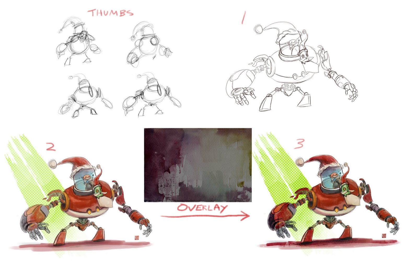
Robo Santa progress shots


A friend of mine requested for a lil tutorial for the Santa piece. And when you ask, you receive :D

So first off I started out with some thumbnails. It is very easy to underestimate how much you can solve with thumbnails. It is a quick way to design and see what works and what doesnt without investing too much into the final piece and then finding these issues. One I found a design I like I enlarged the thumbnail and drew over the top of it.

In stage 2 I simple coloured the drawing in. I used a round brush with spacing set to 20% with size jitter and opacity set to pen pressure. I didnt want to go for a fully rendered painting look but let the drawing do most of the work and have loose paint work done. So I didnt mind having some patches where areas are not fully coloured in, almost like they are just washes of colour but I did add a few tones in there to slightly help sell the form. The green pattern in the background is a stamp brush that made that diagonal slash which I then ran through a halftone filter to get the spots.

Theeeeen I grabbed a photo of some watercolour washes from the internet and put it over the top of the image as an overlay layer. I lowered the saturation of this texture as not to affect the existing colours too much. And I altered the levels to make sure the contrast is lower and wouldn't affect the ones I established too. And voila! Done and done! :)

30 November 2010

By the Power of Grayskull!!!!!!


Heres a work in progress shot of my current painting for the AIBJumble blog. The theme is 80s cartoon and if you cant guess which one this is..... for shame! There was quite a wide selection of great cartoons to select from, it got me in the mood to go through some of those 80s cartoon intros. C'mon, just check these out: Theme 1, theme 2, theme 3 and theme 4.

Anyway for this image I went for the iconic He-man pose with some Frazetta influences. Its that old fantasy composition of a heroic character posing atop a pinnacle. Originally I was going to keep a plain sky as the background but thought I could create more drama with the castle Grayskull looming over the character. The two towers on either side makes for a good framing device too. I took care to try keep a flowing composition, keeping most of the diagonals following one path so its not too hectic. You can probably see it in how the spine of the cat flows into the left edge of the rock and the tail leading you back upwards along the tower with the right tower continues back down the cat's spine. Adding a mist of atmospheric perspective between most of my elements is a way of separating them to enhance readability (always think of that 'initial read'). If the values of the castle were as strong as the character they will fight for attention (contrast in details (economy)  and values). Even the cat's body behind the hero will have some atmospheric perspective to cut him out from the hero's silhouette. A problem I faced was the cat's head, it is close to the edge of the painting and his body is facing outwards and if his head followed that direction then the viewer could be lead out of the painting by his gaze. My solution was to turn his head inwards some more and keep his eyes looking in. There you go! Some of the inner workings of this painting thus far. I think we should end with THIS!

28 November 2010

Christmas Card For All!


Its just around the corner folks so here is a Christmas card to all the lovely people visiting my blog. Hope you guys have a gooood festive one! Maybe you'll get a present just like this robot Santa! Aha!

25 November 2010

Some Studies


Been into traditional art recently after walking around an art gallery back home in Manchester when I went to visit some old friends. One of the paintings I saw in Manchester was by Edmund Blair Leighton and his work was so good I felt compelled to do a study of one of them. The other painting is by William Bouguereau. A few of my colleagues undertook the task too and we were all perplexed by how subtle his colour choices and forms are. Well, back to the drawing board :P
Ive included some progress shots. As well as informing others its also good for me to see too so I can reassess my methods in future :P
My first step is to block out the image, I want to be accurate with the foundation and placements but not so much in the colour yet. That comes later when Im comfortable with the drawing stage. In the last step I fiddled around with the proportions after reviewing the image with the original some more.

23 November 2010

Lickitung again


Had a lil bit of a repaint :P

22 November 2010

Study


A study Ive started ages ago and forgot about. Just finished it off. I think its after Andrew Loomis but dont hold me to that :P

19 November 2010

A Call To Arms


A warning to the people... This is WAR!

Dominance War V is approaching and the preliminaries has already begun with the real war closing in. It is time to take sides in this epic art challenge! I'll be taking up arms and flying the colours of CGHub. A few of my colleagues will be fighting too so we hope to meet you on the battle field!

EDIT: Hmmmm theres been some recent politics lately involving the challenge. We'll see what happens...

Pokemon Lickitung


Pokemon!!!!!!!!!! Redesign for a CGHub contest.
Lickkkkkkkkiiiiiiitung!!!!!!

17 November 2010

Some Naked People (and some naked people with clothes)!


Well I havent scanned pages from my sketchbook in a while so heres a lil update on whats been going on there. These are pages from my doodling sketchbook (where I put studies and idea sketches, havent tried an actual drawing in a while). I thought it would be interesting to see, I dont always try to make a pretty picture, the aim is to study and learn so you might find a lot of unfinished sketches or where I just isolate an arm I am interested in. If you see upside down drawings that is because I dont like drawing close the the edge of the page with the ring binds on my right hand side.


Some life drawings from my life drawing sketchbook. My goals in life drawing changes, I always try to make the most of my classes and learn something new so I often come in to class with a slight plan. For example, since Im a concept artist and I often have to reconstruct the figure from my imagination, sometimes in life class I might try to look at the model fewer times and look at my drawing more. Or I might stay on the construction of the figure throughout the pose as its a weakness of mine. Sometimes I might just draw one part of the figure I want to study, if there is an angle of the head or if the arm is raised in a position that I am not too familiar with and havent seen many times before then I'll just draw that over and over (especially if the rest of the pose is ordinary, screw always trying to complete a drawing, this is what I call studying). Buuuut having said all that I have just selected the drawings that is more refined lol :P
One time it was a suggested theme to draw with out left hand. Bah! Im not a great fan of that, I understand that it helps you to properly observe instead of guessing but I prefer to measure with plum lines. That is imagining a vertical (or horizontal) line across the angle you are observing, use that imagined right angle to 'flatten' the form when you observe. Decide what that angle and line is before committing it to paper. Then check it again on the model and adjust if necessary. Be comparative with different elements of the body and how they relate positionally to each other. This should be initially laid in the construction (gestural) stage and then when you come to build on the gestures, use measured angles to add in structure.

Hope that gives a lil insight into how I treat life classes and my idea of the difference between drawing and sketching.

Animated Walk

Click to play!

Sorry for the lack of updates. Ive been slightly ill and a tad bit lacking in inspiration lately :( Buuuut just to fill in the void I thought I'd at least post up this random walk cycle :P Feeling a bit nostalgic about my old animation course especially after watching the showreels again hahaha.
Annnd Ive been receiving a few fan mails lately (thanks guys! ^_^) its cool to hear your stories and Im glad people like whats going on here. Do feel free to drop me a line with questions or if you just wanna say 'Hi'!

9 November 2010

Colour Study


I need to do more studies! So I delved into my art folder and to find a painting to copy from and decided this one was good for studying skin tone colours. Im afraid I dont know who the original artist :( More to come

6 November 2010

Ghostly Passion

Done for the next Sketchoholic competition hosted by Daniela Strijleva. The topic was 'Ghost' and I tried to do something with a different feel to my usual work. The temptation was there to create a gruesome monster but I thought Id try depicting something more atmospheric and softer.
Oh... check out the Epose 8 artist profiles, you might find a familiar face there :P

2 November 2010

Its A Me Ben Ho


It was International Self Portrait Day and tons of artists around the world drew and painted their creative lil faces! Ive been playing football so maybe thats why I look tired... or maybe its because Im thinking "it doesnt look like me!" :P