
A friend of mine requested for a lil tutorial for the Santa piece. And when you ask, you receive :D
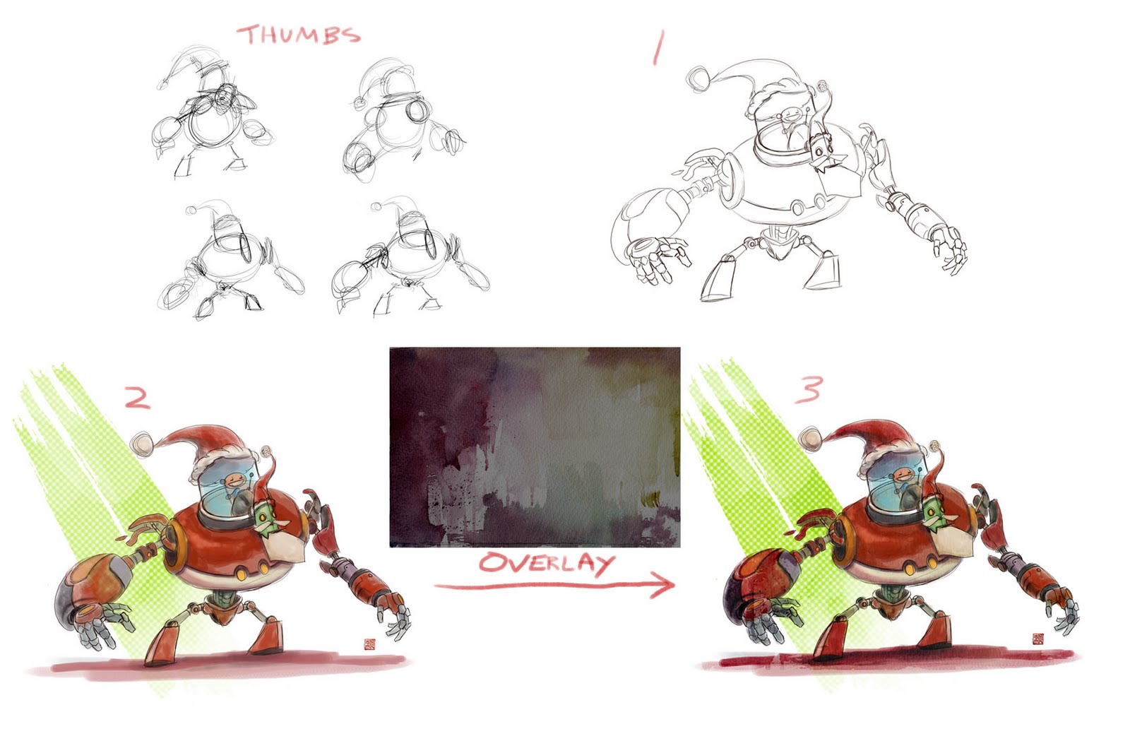
So first off I started out with some thumbnails. It is very easy to underestimate how much you can solve with thumbnails. It is a quick way to design and see what works and what doesnt without investing too much into the final piece and then finding these issues. One I found a design I like I enlarged the thumbnail and drew over the top of it.
In stage 2 I simple coloured the drawing in. I used a round brush with spacing set to 20% with size jitter and opacity set to pen pressure. I didnt want to go for a fully rendered painting look but let the drawing do most of the work and have loose paint work done. So I didnt mind having some patches where areas are not fully coloured in, almost like they are just washes of colour but I did add a few tones in there to slightly help sell the form. The green pattern in the background is a stamp brush that made that diagonal slash which I then ran through a halftone filter to get the spots.
Theeeeen I grabbed a photo of some watercolour washes from the internet and put it over the top of the image as an overlay layer. I lowered the saturation of this texture as not to affect the existing colours too much. And I altered the levels to make sure the contrast is lower and wouldn't affect the ones I established too. And voila! Done and done! :)
1 comment:
cool breakdown ben, i can see you really care about getting the right pose before progressing. I'd love to see more of your thumbnails of finished pieces...
but i often like the way a texture can effects painted colours, sometimes i oversaturate or colour balance a texture to push unexpected results. cheers for the tips!
Post a Comment