17 February 2011

Link: Wip #2


A little update on where I am up to. Added some base colours via hard light layer. I prefer using this for base colours over a colour layer and I keep the black and white values pretty low in contrast because these next few steps will shoot them up anyway and you dont want to overkill it. Used a multiply layer and some cool colours to punch out more shadows and did the reverse for the highlights, using hot colours in an overlay layer to pick out lighter areas. A full tutorial will come after the painting is completed.

Marvel Vs Capcom 3 is out tomorrow... updates might suffer :P

16 February 2011

Link: Wip #1 - He come to town!


A wip of what Ive been working on. I think my previous wip is abandoned again :P But Ive been meaning to continue some of the projects Ive got brewing in my head so now heres something to show for it.

9 February 2011

WIPs from the Void!


I have quite a few work in progress pieces that never see the light of day. Sometimes when Im not feeling motivated about a piece they end up being dumped into a folder with the odd chance that I might someday return to it and continue painting it or even take a new direction. Here is an example Im working on. The left image is something I cooked up a couple months ago but lost interest in. For some reason I thought back to it and looking at it now I see the flat on perspective wasnt grabbing me as well as the blank background. That leads me to take on a new direction you see on the right. Still very much a wip so lets see where we get to next...

Draws


A few studies. Anatomy sketches after Michael Hampton and some expression studies after Jin Kim. Btw if you havent seen Tangled yet I strongly suggest you go right NOW! Loved the film, it felt like a good old Disney animation which is long overdue. Go animation!!!!! Great to see another Pixar film nominated for Best Picture award at the Oscars too. Looks like people are taking the medium seriously now and not just exclusively for children.

3 February 2011

CNY


Happy New Year!

25 January 2011

WiP: All Our Battles 2


Still not quite finished update. Im afraid there was a stoppage at the last hurdle of this piece... I got distracted *cough*Mass Effect 2*cough*

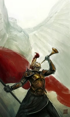
Well anyway, this is something I envisioned when I listened to Europa by Globus. I wanted something fairly epic in scale and heroic like a scene of a rally cry. I am a big fan of using up-shots to enhance the epic feel, like you are mere mortals looking up at these towering figures. I kept enlarging the size of the flag too, a small one felt out of place in the scale I was trying to convey so it kept being sized up. Ive included a second song too! Consider it the after theme for the painting. Its Proud Nation by Immediate Music (the same people as Globus).

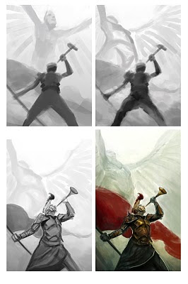
Ive also attached a few progress shots to show you. I started with big shapes and then gradually narrowed down into smaller details. Think of it like sculpting, you need to chip away the big shapes before you go into the finer points, you dont jump in and chisel the nose of a figure do you? I also keep the values quite close together, I plan to add the darkest darks and lightest lights towards the end committing early is a bit of a trap as it gives you less control of where the best place to use light and darks. Also overlays and other blending layers alter your values anyway so I try to be loose with the grayscale and think of it as a base for me to build on top of later. The colouring via the blending options are just to block in colour with hints at what the lighting is doing, its just easier for me to think about things one at a time, then I flatten the painting down and paint on top of it normally.

Oh and another thing... If you are an animation student at the Arts University College at Bournemouth check out this new blog Geoff King set up AUCB Animation. It is a good opportunity to get some critique and feedback from the alumni crew. If you are a student I think you should take advantage of this opportunity. Cheers :D

20 January 2011

WiP: All Our Battles


A wip of what Ive been cooking for the AIB Jumble. Still some more painting to be done on this. I was inspired by Kekai Kotaki's work for this piece and started off in grayscale adding colour by overlay and hard light layers. For more tips on how to colour up a grayscale image check out the idrawgirls blog. I also planned the compotition of this image as if it was a book cover illustration. More details on this piece when its done...

In other news... my Sketchoholic picture below finished runner up! I hope I can do one better next time :D Taking lil steps forward! And the next day I was quite surprised to find myself listed on Parka Blog's Art Blogs of Note. Its all quite flattering stuff but a part of me feels unworthy hahaha. I still feel I have more to offer and developing to do, theres no room for complacency. Since I first started drawing seriously I thought to myself that as long as I am improving and making some progress Im heading in the right direction because I knew that I would not quit drawing and painting... EVER! So lets keep pushing ourselves and appreciate the progress we are making :)

17 January 2011

Skelanimal Class


New painting for a Sketchoholic competition hosted by Mitchell Bernal (creator of Skelanimals and visual development artist at Walt Disney Animation Studio). Ive recently been hooked on artwork done for animation which is probably evident in my recent work. Im a greedy person! I dont like to just do one style, I want to try all sorts of ways to express my creativity. More to come for sure!

EDIT: Please welcome the new addition to the concept art team here at Blitz Games Studio... Marco Caradonna!

9 January 2011

Lady in Red


First post of the new year! This is something done for the AIB Jumble blog. It is based on a random shape given to us to manipulate. I used this opportunity to experiment with a style, its a nice break for me as I normally aim for a realistic look.

Hope everyone had a good Christmas and looking forward to an even better New Year full of creative energy!!!!!! More updates to come... I need to up my productivity :P

In other news: check out this blog Muddy Colors for lots of good art talk and advice from some of the leading sci-fi and fantasy illustrators.

Oh yeah... and this now means I have been at Blitz Games Studio for a year :D

20 December 2010

Christmas Wishes


Merry Christmas Everyone!!!!!!!!!!!!!

Ayayayayay!!!! Ive been pretty ill recently, all this cold weather and snow is probably to blame. Anyhoo Im feeling better now so lets go enjoy the snoooooow!!!!!! ^_^

13 December 2010

I Have The Poweeeeeeerrrrrr


For the AIB Jumble blog. Buuuut unfinished!!!!!!! :'( I have actually had one of those moments where Ive been looking at this for too long, without a clear direction of what I wanted to do with the colours and messed around with it too much that I lost some of the motivation for this one. Soooo the plan is to just leave this by the side for a while, let it rest and come back to it fresh in a future date. Painting and drawing isnt always second nature to me, there is still a lot of struggle and problem solving for every piece. I believe its like this for a lot of artists even well established ones too so dont feel bad for hitting one of these snags. We just need to keep ploughing forward, people may not see the amount of effort in clearing the snowy path but they will see the finished result of the clear pavement! ;)

Tips n Tricks #10: Radial GaGa!


You know, its been a while! I almost forgot about this little section of my blog and hearing some positive feedbacks about this reminded me to keep it up. If you have something you would like me to try explain do ask away!

Anyway, this is quite a simple trick. Im sure a lot of people may know this already but I didnt until recently :P I was trying to make a motion blur at work one time and wasnt very successful so I asked a colleague to help me out and he showed me how to use a radial blur to add motion blurs. Simply copy the whole image (ctrl+shift+C to copy all layers) and then apply a radial blur filter via the topbar Filter>Blur>Radial Blur. A window will open up where you can pick the center of where you want the circular motion to originate from. This might take a few trials and error to get it to look correct but once it does, just erase away parts of the blur to reveal the original image underneath it.

6 December 2010

Special Delivery

Just got this delivered today. Ballistic Publishing Exotique 6 showcases this year's selection of digital character art from both 2d and 3d. Again, I want to thank Paul Hellard and his team at Ballistic Publishing for selecting my work a second time. I hope I can build on this and reach greater heights.

This is the page Im featured on. My painting is the one on the right.

So here are the two Ballistic books I have found myself in. Its quite an odd feeling, hasn't really sunken in yet I dont think. Again, I remember where I came from (learning to paint and facing many failures and struggles) so Im determined to keep that going and I hope you all too XD

5 December 2010

Robo Santa progress shots


A friend of mine requested for a lil tutorial for the Santa piece. And when you ask, you receive :D

So first off I started out with some thumbnails. It is very easy to underestimate how much you can solve with thumbnails. It is a quick way to design and see what works and what doesnt without investing too much into the final piece and then finding these issues. One I found a design I like I enlarged the thumbnail and drew over the top of it.

In stage 2 I simple coloured the drawing in. I used a round brush with spacing set to 20% with size jitter and opacity set to pen pressure. I didnt want to go for a fully rendered painting look but let the drawing do most of the work and have loose paint work done. So I didnt mind having some patches where areas are not fully coloured in, almost like they are just washes of colour but I did add a few tones in there to slightly help sell the form. The green pattern in the background is a stamp brush that made that diagonal slash which I then ran through a halftone filter to get the spots.

Theeeeen I grabbed a photo of some watercolour washes from the internet and put it over the top of the image as an overlay layer. I lowered the saturation of this texture as not to affect the existing colours too much. And I altered the levels to make sure the contrast is lower and wouldn't affect the ones I established too. And voila! Done and done! :)

30 November 2010

By the Power of Grayskull!!!!!!


Heres a work in progress shot of my current painting for the AIBJumble blog. The theme is 80s cartoon and if you cant guess which one this is..... for shame! There was quite a wide selection of great cartoons to select from, it got me in the mood to go through some of those 80s cartoon intros. C'mon, just check these out: Theme 1, theme 2, theme 3 and theme 4.

Anyway for this image I went for the iconic He-man pose with some Frazetta influences. Its that old fantasy composition of a heroic character posing atop a pinnacle. Originally I was going to keep a plain sky as the background but thought I could create more drama with the castle Grayskull looming over the character. The two towers on either side makes for a good framing device too. I took care to try keep a flowing composition, keeping most of the diagonals following one path so its not too hectic. You can probably see it in how the spine of the cat flows into the left edge of the rock and the tail leading you back upwards along the tower with the right tower continues back down the cat's spine. Adding a mist of atmospheric perspective between most of my elements is a way of separating them to enhance readability (always think of that 'initial read'). If the values of the castle were as strong as the character they will fight for attention (contrast in details (economy)  and values). Even the cat's body behind the hero will have some atmospheric perspective to cut him out from the hero's silhouette. A problem I faced was the cat's head, it is close to the edge of the painting and his body is facing outwards and if his head followed that direction then the viewer could be lead out of the painting by his gaze. My solution was to turn his head inwards some more and keep his eyes looking in. There you go! Some of the inner workings of this painting thus far. I think we should end with THIS!